A YEAR AT THE MANOR
CASE STUDY : FULL SITE REBUILD 2019-20
Project Outline : Fully redesign and rebuild the international website of The University of Law, with specific focus on creating ‘mobile first’ responsive designs and an updated modern look and feel. The cluttered old site architecture was to be reimagined from the ground up, improving the general usability, UX and customer journey to maximise lead generation and goal conversion.
I was part of a small, diverse internal team of web specialists, developers and copywriters assembled for this task, working alongside two award-winning external creative and SEO agencies. Here’s the story.

PROJECT DETAILS: METHODS & MANAGEMENT
With a budget of over £700,000 and a time frame of nearly 14 months (after discovery), this multi-stakeholder project was run according to Agile methodologies, and as such we focused heavily on continuous evaluation of our roadmap and KPIs.
To keep the project running smoothly we utilised a number of general project management and comms tools, including Smartsheet (task assignment/tracking), Slack (external agency communications), and Trello (Aglie development sprint tracker).
MY ROLE : CONTENT MIGRATION LEAD / IA DESIGNER
My primary role was design and deployment of the Information Architecture, and management of the content migration & population team. I also managed the user testing process, beta release monitoring and subsequent bug fixes, as well as helping manage the relationships with award-winning creative agency Brand 42 (Top Gear, Club Rakuten, Mail Online) and unrivalled SEO consultancy Blue Array (Zoopla, Unidays), freelance external developers and internal key stakeholders (ULAW/GUS executive teams, legal departments, marketing & product managers, tutors, campus deans, etc).
THE ULAW UX REIMAGINED
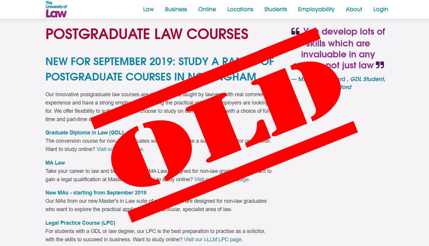
The original ULAW website was outdated and uninspiring. There was much duplicated content and no easy way to navigate based on user preferences. All study types were only navigable from the main menu with no proper information hierarchy.
The video in the next slide shows the enhanced study section on the new website. I was pivotal in defining the hierarchical site structure, by approaching the study section like an e-commerce environment I was able to create an intuitive UX solution.
Video courtesy of creative design agency Brand 42.
INFORMATION ARCHITECTURE & CMS STRUCTURE
When designing the new IA my main aim was to create easy pathways for the user to drill down into the various study areas, making sure that the journey was streamlined.
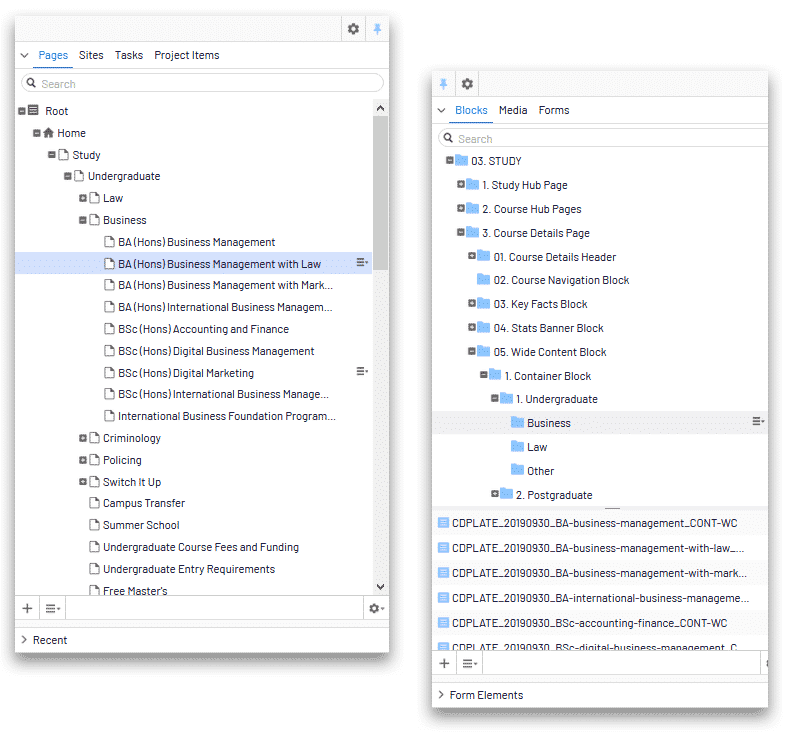
I also designed and implemented a new CMS folder structure to manage the new modular pages, ensuring that the in-house staff would be able to quickly and easily manage content updates. To further assist this process I created a technical manual for all the modules, colour coded to show what was editable… ensuring the website will look as good as new long after project completion.
BETA RELEASE TESTING
Working in a university has it’s advantages when it comes to running a project such as this. After the in-team alpha testing was complete, I was able to leverage the site’s natural audience (the student population) to be the beta test bed. We asked our testers to shop for their own course (whether they be part of the undergraduate business school, or the postgraduate law school, etc), and then to navigate for similar courses, different campuses, and to find all the course and social support pages.
We also picked some testers to take on the roles of ‘international student’, ‘concerned parent’, ‘prospective student sixth former’, among others. In addition to the student population, we also included many in-house and remote tutors in the process, too, again with specific focus on their particular specialism.
FAULT TRACKING AND BUG FIXING
In order to keep costs to a minimum, I was able to utilise a pre-existing platform, Smartsheet, to track the beta testing faults and bug fixes. The testers were asked to log each found error as a ticket in Smartsheet, and then we had a member of the in-house marketing team triage the faults under different headers; for launch, nice to have, future phase, non-relevant, etc.
My team then fixed the errors, under my guidance and prioritisation. I took on the more complex technical fixes myself, and also QA’d all of the team’s fixes before release. The whole testing and bug fix process took around 4 weeks, and by using the student population and wider university staff, as well as a pre-existing ticketing platform, I was able to run the entire process for no added cost.

VERDICT MAGAZINE DIGITAL DELIVERY
Another improvement I made during my time at ULaw was regarding their quarterly industy magazine, Verdict. Delivered as a non-print, digital only publication, the magazine was just a PDF link hidden on the website with only the current issue available to view. I created an archive page on the new site which carries links to all issues as well as the most recent. I also set up a Flipsnack account so the marketing team could easily host the magazine as a slick digital flip book.
Please click the image to view the solution.
NON-PROJECT RESPONSIBILITIES
- Coordinating content changes to the legacy global website
- Assisting with web/social content creation, closely monitoring engagement for continuous improvement of messaging
- Giving support to the central marketing team in the development and delivery of digital marketing campaigns
- Working with the PR and Social media team to support their content strategy and digital communications roadmap
- Coordinating the university’s web response to Covid-19

THE RESULTS
I am very proud to have played a pivotal role in this extensive project. Shortlisted for ‘Best Website’ at the 2021 Heist Awards, the finished site is a sea change from the old - fully mobile responsive with one-click enquiry always present, and a robust fully searchable site architecture that steers the user easily to where they need to be with minimum friction and cognitive load. With its intuitive structure and modular design, this is a site ready for the rapidly growing world of online focused education. The resulting KPIs speak for themselves.
↑
%
TIME SPENT ON SITE
↑
%
GOAL CONVERSION
↑
%
NEW LEAD GENERATION
A YEAR AT THE MANOR
CONTRACT CASE STUDY
CASE STUDY :
FULL SITE REBUILD
Project Outline :
Fully redesign and rebuild the international website of The University of Law, with specific focus on creating ‘mobile first’ responsive designs and an updated modern look and feel. The cluttered old site architecture was to be reimagined from the ground up, improving the general usability, UX and customer journey to maximise lead generation and goal conversion.
I was part of a small, diverse internal team of web specialists, developers and copywriters assembled for this task, working alongside two award-winning external creative and SEO agencies. Here’s the story.

PROJECT DETAILS :
METHODS & MANAGEMENT
With a budget of over £700,000 and a time frame of nearly 14 months (after discovery), this multi-stakeholder project was run according to Agile methodologies, and as such we focused heavily on continuous evaluation of our roadmap and KPIs.
To keep the project running smoothly we utilised a number of general project management and comms tools, including Smartsheet (task assignment/tracking), Slack (external agency communications), and Trello (Aglie development sprint tracker).

MY ROLE :
CONTENT MIGRATION
LEAD / IA DESIGNER
My primary role was design and deployment of the Information Architecture, and management of the content migration & population team. I also managed the user testing process, beta release monitoring and subsequent bug fixes, as well as helping manage the relationships with award-winning creative agency Brand 42 (Top Gear, Club Rakuten, Mail Online) and unrivalled SEO consultancy Blue Array (Zoopla, Unidays), freelance external developers and internal key stakeholders (ULAW/GUS executive teams, legal departments, marketing & product managers, tutors, campus deans, etc).

THE ULAW UX
REIMAGINED
The original ULAW website was outdated and uninspiring. There was much duplicated content and no easy way to navigate based on user preferences. All study types were only navigable from the main menu with no proper information hierarchy.
The video in the next slide shows the enhanced study section on the new website. I was pivotal in defining the hierarchical site structure, by approaching the study section like an e-commerce environment I was able to create an intuitive UX solution.
Video courtesy of creative design agency Brand 42.
INFORMATION ARCHITECTURE
& CMS STRUCTURE
When designing the new IA my main aim was to create easy pathways for the user to drill down into the various study areas, making sure that the journey was streamlined.
I also designed and implemented a new CMS folder structure to manage the new modular pages, ensuring that the in-house staff would be able to quickly and easily manage content updates. To further assist this process I created a technical manual for all the modules, colour coded to show what was editable… ensuring the website will look as good as new long after project completion.

BETA RELEASE TESTING
Working in a university has it’s advantages when it comes to running a project such as this. After the in-team alpha testing was complete, I was able to leverage the site’s natural audience (the student population) to be the beta test bed. We asked our testers to shop for their own course (whether they be part of the undergraduate business school, or the postgraduate law school, etc), and then to navigate for similar courses, different campuses, and to find all the course and social support pages.
We also picked some testers to take on the roles of ‘international student’, ‘concerned parent’, ‘prospective student sixth former’, among others. In addition to the student population, we also included many in-house and remote tutors in the process, too, again with specific focus on their particular specialism.
FAULT TRACKING
AND BUG FIXING
In order to keep costs to a minimum, I was able to utilise a pre-existing platform, Smartsheet, to track the beta testing faults and bug fixes. The testers were asked to log each found error as a ticket in Smartsheet, and then we had a member of the in-house marketing team triage the faults under different headers; for launch, nice to have, future phase, non-relevant, etc.
My team then fixed the errors, under my guidance and prioritisation. I took on the more complex technical fixes myself, and also QA’d all of the team’s fixes before release. The whole testing and bug fix process took around 4 weeks, and by using the student population and wider university staff, as well as a pre-existing ticketing platform, I was able to run the entire process for no added cost.

VERDICT MAGAZINE
DIGITAL DELIVERY
Another improvement I made during my time at ULaw was regarding their quarterly industy magazine, Verdict. Delivered as a non-print, digital only publication, the magazine was just a PDF link hidden on the website with only the current issue available to view. I created an archive page on the new site which carries links to all issues as well as the most recent. I also set up a Flipsnack account so the marketing team could easily host the magazine as a slick digital flip book.
Please click the image below to view the solution.
NON-PROJECT
RESPONSIBILITIES
- Coordinating content changes to the legacy global website
- Assisting with web/social content creation, closely monitoring engagement for continuous improvement of messaging
- Giving support to the central marketing team in the development and delivery of digital marketing campaigns
- Working with the PR and Social media team to support their content strategy and digital communications roadmap
- Coordinating the university’s web response to Covid-19

THE RESULTS
I am very proud to have played a pivotal role in this extensive project. Shortlisted for ‘Best Website’ at the 2021 Heist Awards, the finished site is a sea change from the old - fully mobile responsive with one-click enquiry always present, and a robust fully searchable site architecture that steers the user easily to where they need to be with minimum friction and cognitive load. With its intuitive structure and modular design, this is a site ready for the rapidly growing world of online focused education. The resulting KPIs speak for themselves.
↑
%
TIME SPENT ON SITE
↑
%
GOAL CONVERSION
↑
%
NEW LEAD GENERATION
SEND A MESSAGE
ADAM KNIGHT | Digital Content Creator & Multi-Channel Marketing Specialist
Delivering Creative Digital Solutions Since 1999

